Graphic
Design
Portfolio
Hey friend, it's Jess, thanks for stopping by
Packaging Line
Company:
Georganics
Tools:
Illustrator
InDesign
Photoshop
Introduction to After Effects
Typography, Motion, & Early 2000’s Soft Rock
Planning ahead is worth it!
Who would’ve thought?
This video marked my first major After Effects project, but surprisingly, it’s also the fastest workflow I’ve ever had. How did I swing that? I spent 60% of my time building static layouts and compositions, 30% learning how to use this beast of a program, and only 10% actually animating.
By breaking the process into manageable steps and nailing the basics of design, composition, and typography first, the animation phase felt like a breeze.
This project reshaped how I approach creative work. Turns out, a little planning can turn a daunting animation piece into something manageable and even enjoyable.
The lesson here: sometimes, hitting pause on the instinct to dive right in can actually make the process faster, smoother, and a whole lot more fun.


Print, Print(Making) & Web
Frankenstein Book Cover
Crafted with traditional printmaking tools, this design is hand-carved onto a linoleum block, inked, and stamped.
Typesetting for Web: WIRED Article
Wired magazine’s bold print designs inspired this project to bring their stunning designs back online. A structured grid unravels into intentional chaos, visually mirroring the twists of the narrative for a dynamic, immersive experience.
Rocky Movie Poster
*Recognized Excellence Published Student Award Winner*
Typesetting for Web: WIRED Article
Wired magazine has always been known for its incredible conceptual design. In its print version, its brand allowed for customization of each article based on content and concept. As Wired has transitioned into the digital space, however, they’ve lost this edge.
In this project, I was inspired to refresh their online presence and make it better than it ever was in its print form.

Typography 101
Use a grid. Watch your rag, leading, and whitespace. Establish a clear hierarchy. Stick to workhorse fonts. Mind your widows and orphans (yes, that’s a thing). And by all that is good—if you use Comic Sans…
These are the golden rules of typography. And I followed them—at first.
This article starts on a structured grid, left-aligned, clean, and orderly. But as the story unfolds—following a young man whose life takes one wrong turn after another—the typography begins to unravel. Text blocks shift off-center, rags grow jagged, and overlapping elements create a sense of instability. The composition visually mirrors the protagonist’s descent, transforming the reading experience into something dynamic and immersive.
With this project, I enjoyed playing by the rules—then breaking them, one by one.

Final Thoughts
I went into this project thinking typesetting an already typeset online article would be mind-numbingly boring. But I ended up learning a ton—and even had fun with it.
I saw firsthand how the right font choice can make or break readability. InDesign and I became inseparable as I fine-tuned leading, kerning, and tracking. But my biggest takeaway? The smallest details—rags, spacing, even a single misaligned letter—can subtly disrupt the reading experience. Refining that level of precision didn’t just make the design better; it made me a better designer.

See Professor Bailey? I know how to cite MLA
Morenne, Benoit. “On the Trail of the Fentanyl King.” Wired, 9 March. 2023, wired.com/story/on-the-trail-of-the-fentanyl-king/. Accessed 10 Nov. 2023.
Frankenstein Book Cover: Fine Art & Graphic Design
Mary Shelley’s Frankenstein is one of my favorite pieces in classic literature, and I was thrilled to dedicate a project of redesigning the cover to reflect what the book means to me.

Finding Common Ground with Victor Frankenstein
With every re-read of Frankenstein, I find myself relating more and more to Victor Frankenstein. Now, hold up—it’s not because I experiment with cadavers or make reality-altering decisions without considering the consequences. It’s because, between his fits of melodrama and anguish, Victor finds peace and solace in nature.
Mary Shelley conceived this story on a trip to Geneva, and her love for the Swiss Alps serves as a balm for Victor’s torment. Throughout the novel, the protagonist/antagonist seeks relief in nature—whether climbing snowy peaks, strolling through forests, or laying comatose in a rowboat on a picture-perfect mountain lake.
Shifting the Focus: From Monster to Mountains
For the book cover, I wanted to shift the focus away from Frankenstein’s monster and toward our mutual love of the mountains. I started by searching for photography of the Swiss Alps for inspiration.
The Printmaking Process
Mix, roll, paste, and press—that’s how I ended up with a print of the Swiss Alps. While I love practicing my fine art skills, I’m far from perfect. The ink came out patchy and not as dark as I wanted.
I scanned the image into Photoshop, and with some minor adjustments, I was left with the final version you see here.

Final Thoughts
The rest was simple: building a mockup of the book in Photoshop. I added type that was patchy and uneven to complement the print, giving it a more cohesive, handcrafted feel.
Overall, I’m really happy with how the image turned out. I’m not in love with the typesetting and will likely make edits in the near future. But this project brought together my passion for the outdoors, traditional fine arts, and simple graphic design—everything I love in one piece.

“All I wanna do is go the distance”
I didn’t watch Rocky until I was a young adult (Gen Z), but once I did, I was hooked. What really stuck with me wasn’t just the classic underdog story, but Rocky’s mindset—he wasn’t training to beat Apollo Creed; he was training to go the distance. In life, we don’t always win, but we can always push ourselves to be better.
When I set out to design this poster, I wanted to highlight that scrappy, no-frills training—pounding the pavement, chugging raw eggs, and punching meat in a freezer—versus Creed’s high-end gyms and entourage. That raw, relentless determination is what makes Rocky so easy to root for—and what makes his story timeless.

Email Marketing Campaign
Tools:
Figma, Stripo
Skills:
HTML/CSS
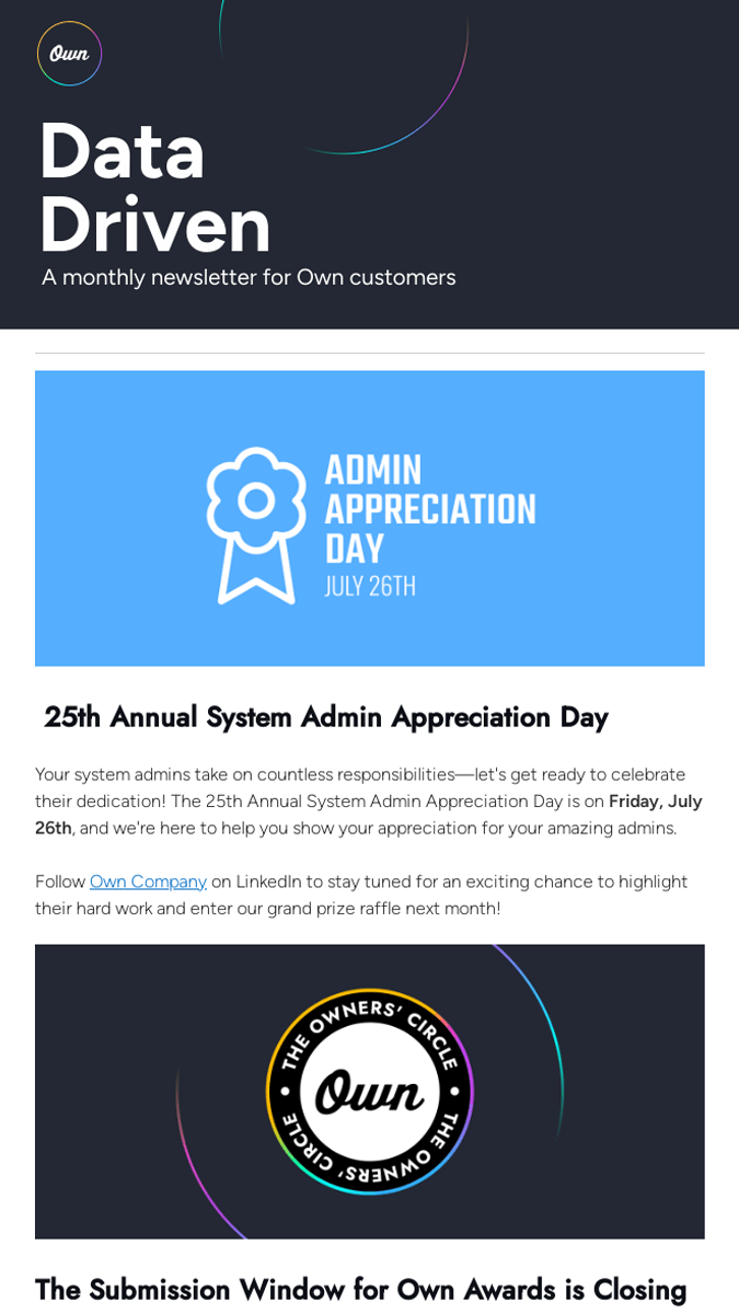
During my internship at Own, I was tasked with building a customer newsletter in Stripo. I tapped into my HTML/CSS skills to fully customize the design while adhering to brand guidelines. The result was stunning and rendered perfectly on my device and browser.
However, when tested across different platforms (seriously, who uses Safari?), the code didn’t hold up.
This experience taught me a valuable lesson in design compromise. When it became clear that the original email wouldn’t work, I had less than one workday to start over and create a new version from scratch. It was challenging to let go of the gradient and beautiful tracking I had envisioned, but I learned that design, no matter how gorgeous, must also be functional.
By making strategic sacrifices—without losing sight of the brand—we were able to finish, test, and send out a new version on time.
This project reinforced my belief that flexibility and adaptability are key components of successful design.
Movie Bumper
Way back when you only had one subscription, cable television, this movie “bumper” would have played right before the film aired, and between five-minute intervals called “commercial breaks”.
Hand Drawn Animation
Over 60 frames of Sharpie illustrations came together to create this clip. Three Sharpies were harmed in the making of this film.
Branding & Identity
Company:
Outdoor Research
Tools:
Illustrator
InDesign
Photoshop
*This project is currently being updated
